If you’re the type of person that gets irritated when your favorite social media site revamps its interface, you haven’t had a lot to complain about regarding Facebook in the past few years. The site has stayed relatively the same as far as design goes, but that could be about to change.
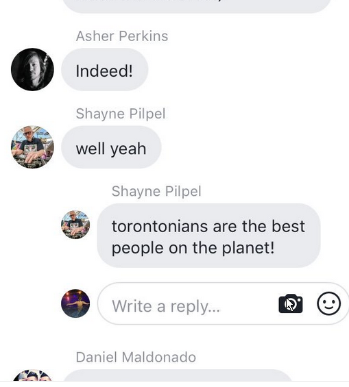
Facebook is testing a design overhaul in the comments section, which would be the first real change since the feature began. Instead of being in a plain text format, comments will now be displayed in a “bubble” layout similar to the one Messenger uses now. Every comments will be in its own bubble, including replies, which will now be more towards the center. It looks pretty much like a text message what, except comments don’t appear on opposite sides.
Twitter user @chrisZsnow posted the screenshot above, simply asking Facebook “Hey @facebook why do comments look like this on my phone?”
For now, like all new features the site decides to roll out, it’s only available to a small number of users. And it’s not being tested on the web version at all, with only a limited number of mobile app users (both Android and iOS) seeing the new layout. And that may be a good thing if early reviews are any indication, because the first group of testers isn’t exactly happy.
The new design is certainly more “pretty,” but it’s also quite cluttered, with bubbles now taking up a lot more real estate on the screen. With the current text format, it’s easy to read through a string of comments. But the new design makes that a tad more difficult.
It’s important to remember this feature is only being tested at the moment, so there’s a decent chance it won’t be released permanently. But if you know someone (or you’re one yourself) who gets annoyed with web site changes, be aware that changes may be on the way.
Be the first to comment on "New “Bubble” Interface Coming to Facebook Comments"